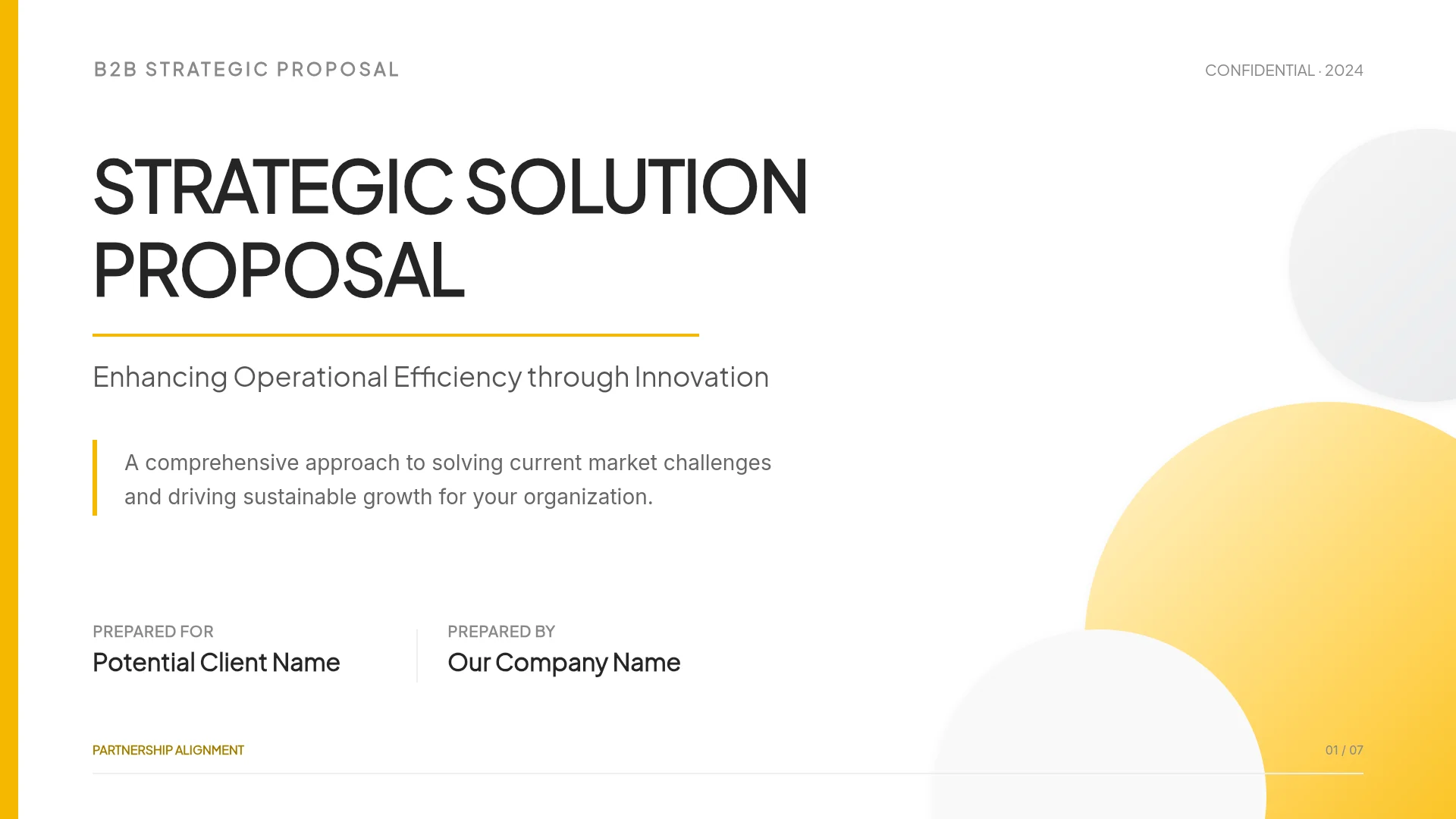
How to Make Slides Look Professional
One message per slide, a clear hierarchy, consistent alignment, one accent color, one or two fonts, and readable contrast, shown on real template slides with before-and-after reasoning, plus where to set design in MOVO.
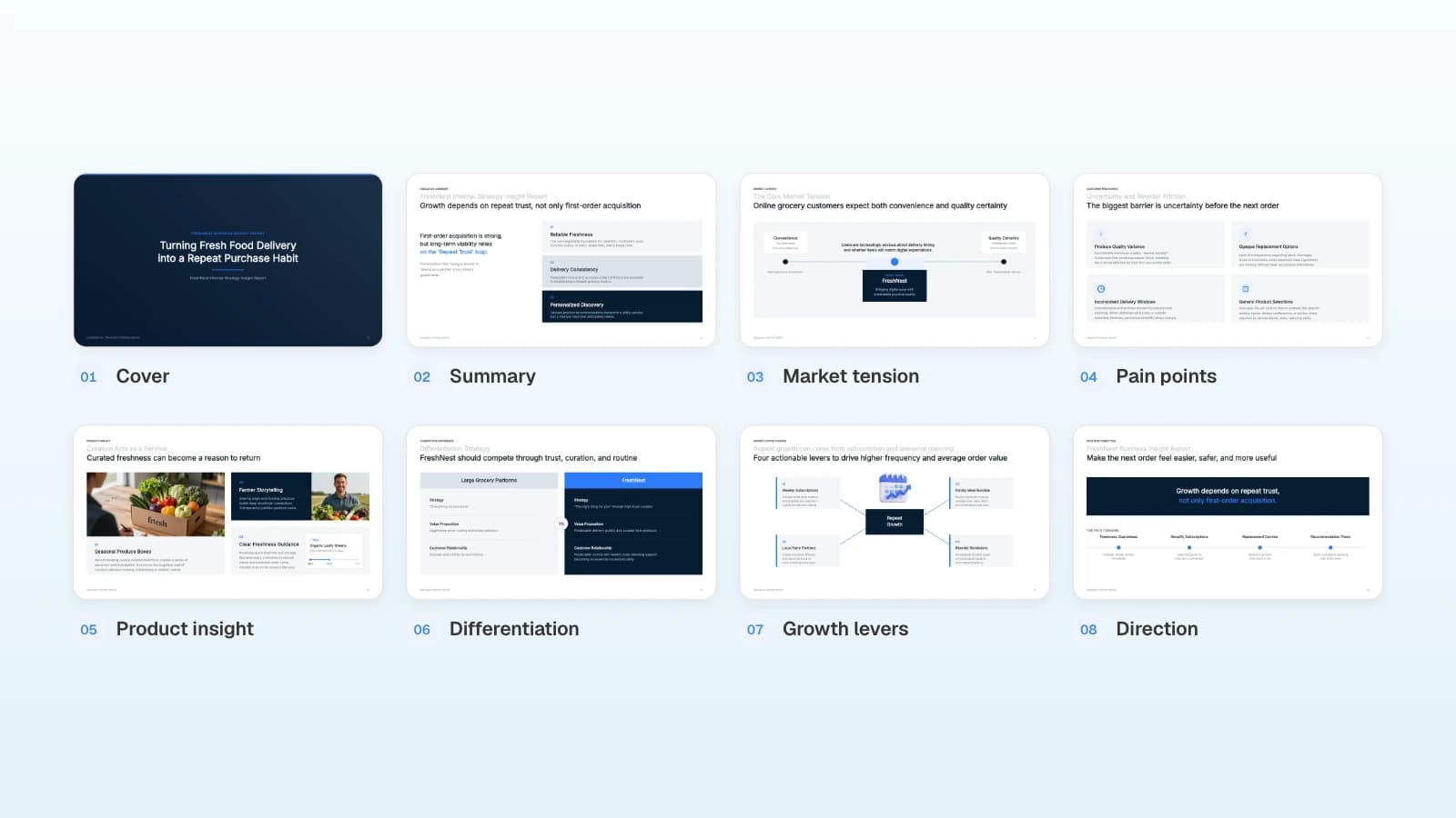
Everything is in the deck, and it still looks cluttered. That is rarely a question of taste. It is usually a rules problem: a slide trying to say three things, titles and body text at nearly the same size, or so many colors that nothing stands out.
MOVO lets you apply these rules both before and after the slides are built. Put them in the request ("one-sentence takeaway titles, one accent color"), rewrite titles as takeaways in the outline, set the audience, density, colors, and fonts in settings, and pick a style narrowed by document type. Once the deck exists, Check layout finds overlapping or spilling text. This guide walks through six rules you can check, with before-and-after reasoning on real template slides, then shows MOVO's design settings and templates to start from.
What makes slides look professional? Six checks
Run these six checks in order. Each one is a yes-or-no question you can answer by looking at the slide.
| Rule | Check |
|---|---|
| 1. One message per slide | Do the titles alone read like a summary of the deck? |
| 2. Three levels of hierarchy | Does your eye go headline → key phrase or number → supporting text? |
| 3. Same place, same spacing | Do the title, footer, and page number sit in the same spot on every slide? |
| 4. One accent color | Does every use of the accent color mean the same thing? |
| 5. One or two fonts | Did you separate levels with size and weight instead of new fonts? |
| 6. Contrast and collisions | Is text contrast at least 4.5:1, with nothing overlapping or spilling? |
How do you get to one message per slide?
Write each title as the slide's takeaway, not its topic. If a slide has two takeaways, split it into two slides.
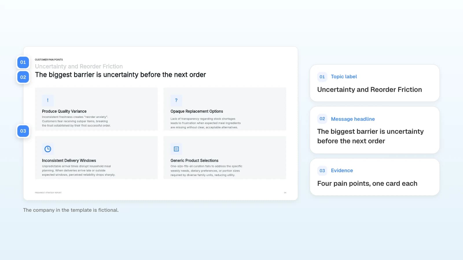
This template keeps both: a small gray topic line ("Uncertainty and Reorder Friction") and a headline that states the finding ("The biggest barrier is uncertainty before the next order"). The four cards below are the evidence for that one sentence. Compare the template's own topic labels with its headlines:
| Topic label (in the template) | Message headline (in the template) |
|---|---|
| Executive Summary | Growth depends on repeat trust, not only first-order acquisition |
| Customer Pain Points | The biggest barrier is uncertainty before the next order |
| Competitive Difference | FreshNest should compete through trust, curation, and routine |
| Strategic Direction | Make the next order feel easier, safer, and more useful |
The labels tell you what a slide is about; the headlines tell you what to take away. Penn State's Michael Alley calls this the assertion-evidence approach: build slides on succinct messages rather than phrase topics, and support each one with visual evidence rather than bullet lists (assertion-evidence.com). Y Combinator's Kevin Hale gives a quick test: a simple slide expresses one idea, so show it to someone who hasn't seen it and check whether they can tell you the point right away (Y Combinator).
- Copy every title into a list. Does it read like a summary of the deck?
- If a title runs past two lines, check whether it holds two messages, and split the slide if it does.
- Cover, agenda, section-divider, and question slides are the exceptions.
How do you build a visual hierarchy?
Decide the reading order (headline, then the key phrase or number, then supporting text) and make each level clearly different in size, weight, or color.
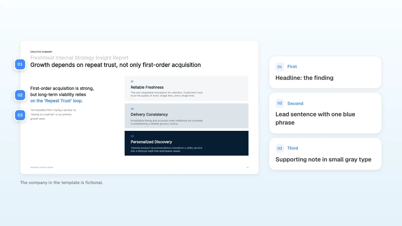
Written as six equal bullets, this summary would give the eye nowhere to land. The template states the finding in the largest type, sets a short lead sentence in bold with one blue phrase, and moves the explanation into small gray text. Kevin Hale's legibility advice points the same way: large type, bold text, a simple font, and good contrast with the background, with key text near the top where people at the back of the room can still read it (Y Combinator).
- Is the largest text on the slide the most important information?
- Does any supporting text grab attention before the headline?
- Are you using only a few weights, such as regular and bold?
What should line up, and how much space should you leave?
Elements with the same job should start in the same place, and spacing should repeat one unit. When the title, footer, and page number stay put, the audience can follow the slide changes without re-scanning.
| Align | How to check |
|---|---|
| Title position | Flip through the deck and watch whether titles start at the same point |
| Footer and page number | Same position and size on every slide |
| Card spacing | Equal gaps between cards that sit side by side |
| Repeated blocks | Every card follows the same order, such as number, heading, description |
How many colors should you use?
Build on neutrals (black, gray, white) and choose one accent color. Use the accent only where the meaning is the same.
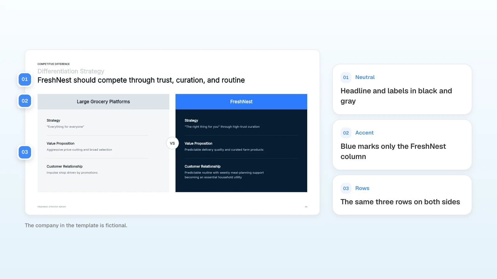
Color both columns brightly and the comparison looks like a toss-up. This template keeps the competitor column gray and gives blue only to FreshNest's header, so the eye goes to the recommended option first; the three rows match on both sides so the comparison stays fair.
Don't let color carry meaning on its own. Microsoft's accessibility guidance says to make sure color is not the only means of conveying information (Microsoft Support), and W3C asks for sufficient contrast between text and background and between colors in graphs (W3C WAI).
- Count every use of the accent color. Does each one mean the same thing?
- Print the slide in grayscale. Can you still tell up from down and good from bad?
- Give chart colors a legend or data labels.
Which fonts should you use?
Use one or two typefaces and create levels with size and weight. For body text, a plain sans serif is easiest to read.
Microsoft recommends familiar sans serif fonts, sufficient white space, and avoiding all caps and heavy use of italics or underlines (Microsoft Support). W3C adds that simple fonts with consistent stroke thickness are often easier to read from a distance (W3C WAI).
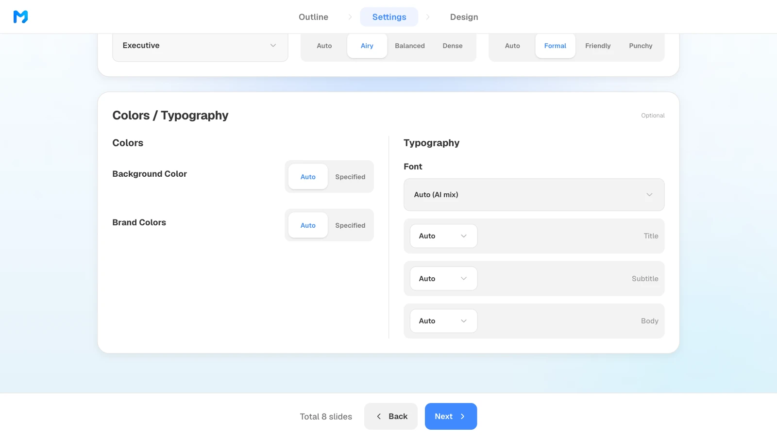
In MOVO's settings step, Typography lets you pick a font or leave it on "Auto (AI mix)," and set minimum sizes for titles, subtitles, and body text. Colors lets you specify a background color and brand colors (primary, secondary, and accent). If your company has a brand font and palette, set them here first; step 3 of the workflow below shows the screen.
How do you check that text is legible?
Keep text-to-background contrast at 4.5:1 or higher (3:1 for large text), keep lines short, and make sure nothing overlaps or spills.
WCAG 2.2 sets 4.5:1 as the minimum contrast for text and 3:1 for large-scale text, defined as at least 18 point or 14 point bold (W3C WCAG 2.2). W3C's presentation guidance also says to limit the text on each slide and to make text and important visuals big enough to read from the back of the room (W3C WAI). Microsoft suggests bullets or short sentences that fit on one line, and only as much chart text as the labels need (Microsoft Support). In PowerPoint, the Accessibility Checker flags text with insufficient color contrast (Microsoft Support).
| Check | How |
|---|---|
| Contrast | If gray text on a tinted background looks faint, measure it with a contrast checker |
| Line length | Cut or split supporting text that runs past three lines |
| Chart labels | Legends, units, and data labels are readable |
| Overlaps and spills | Recheck slides where you edited numbers or lengthened text |
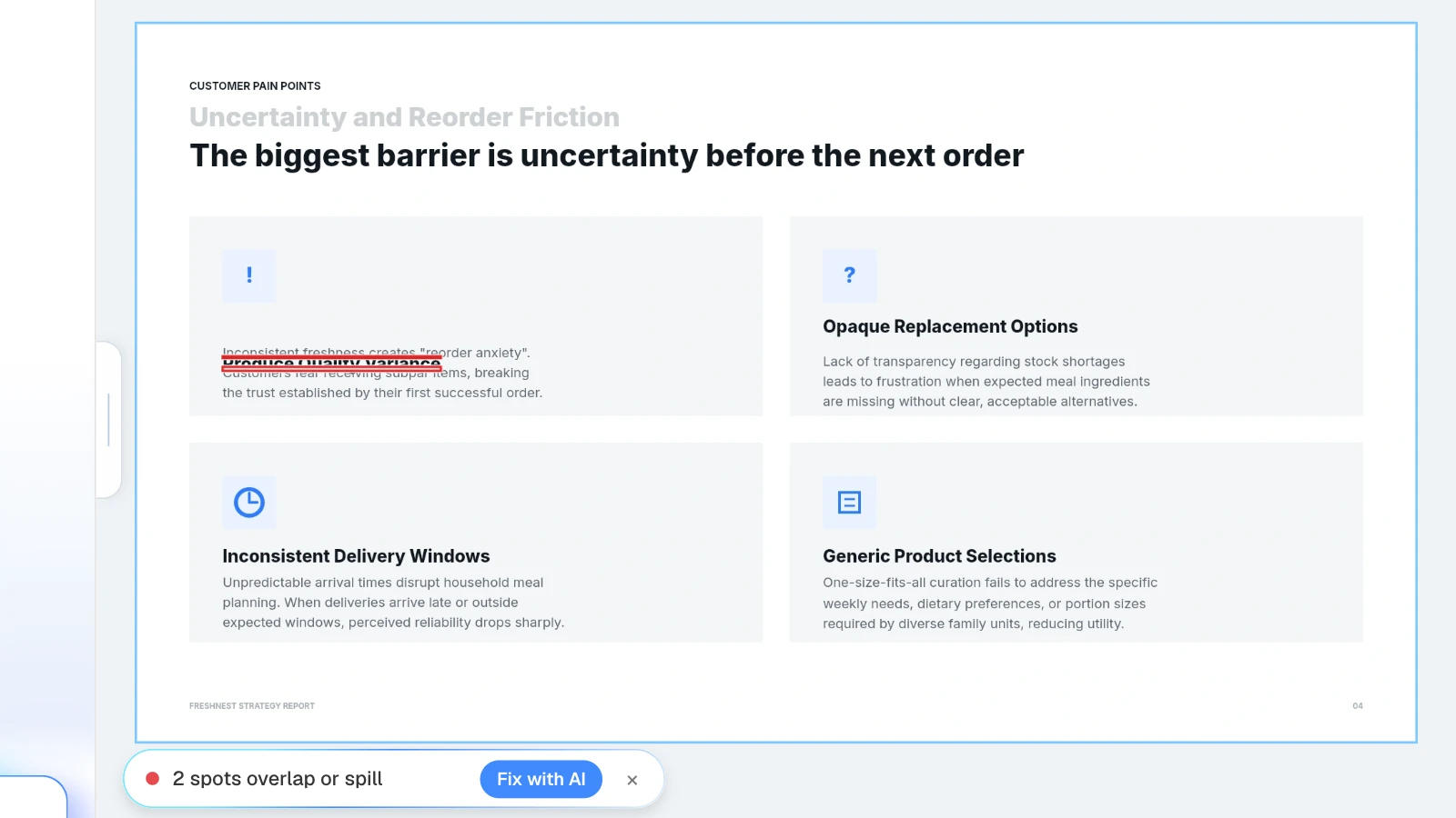
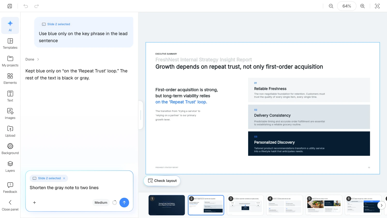
Editing numbers or lengthening a sentence is how text boxes end up overlapping. In the MOVO editor, click "Check layout" below the canvas: MOVO marks overlapping or spilling spots on the current slide in red, and "Fix with AI" asks the AI to tidy that part. Open the exported file once more before you send it.
What does MOVO change for making slides look professional?
- Rules in the request: put design rules in your first prompt, such as "one-sentence takeaway titles, one accent color, one message per slide."
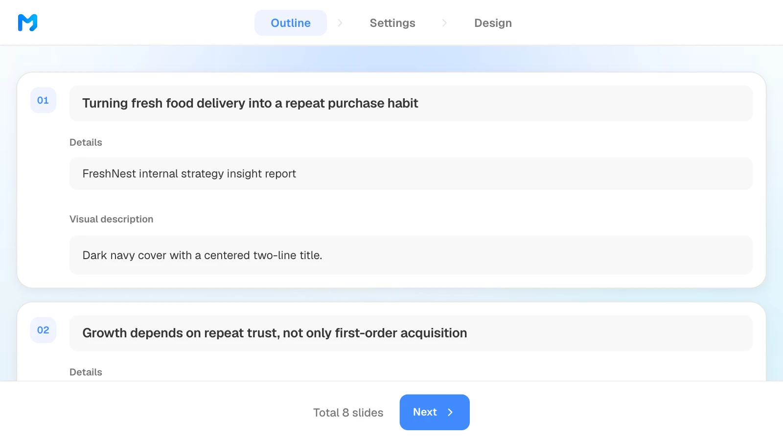
- Takeaway titles in the outline: MOVO shows every slide's title, details, and visual description before building, so you can rewrite titles as takeaways first.
- Settings that set the frame: choose the audience, design density (Airy, Balanced, Dense), copy tone, background and brand colors, and fonts with minimum sizes.
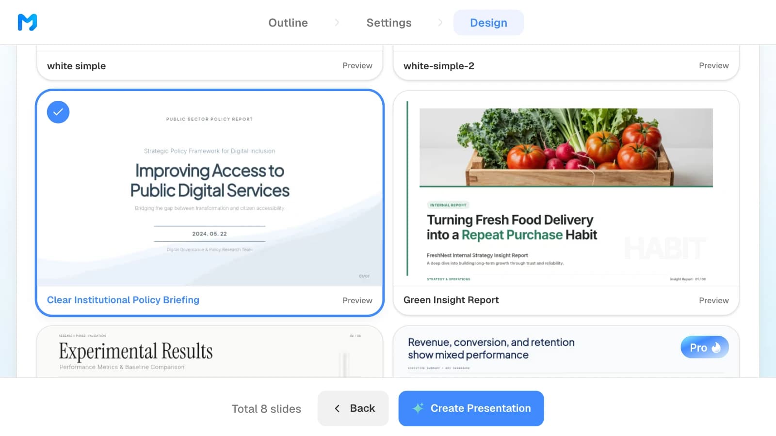
- Styles you can preview: narrow styles by document type and mood, and open "Preview" to see sample slides. Styles marked "Pro" are available on paid plans.
- Slide-by-slide fixes: select a slide and ask, for example, "use the accent color on one number only"; only that slide changes, and Check layout finds overlapping text boxes. A style is a starting point, so still check your logo and brand rules in the result.
How to build a clean strategy deck in MOVO
The pictures below show MOVO's screens filled with this article's example, an eight-slide strategy report for a fresh food delivery service. They illustrate the steps; they are not a recording of a real session.
1. Attach your material and write the design rules into the request
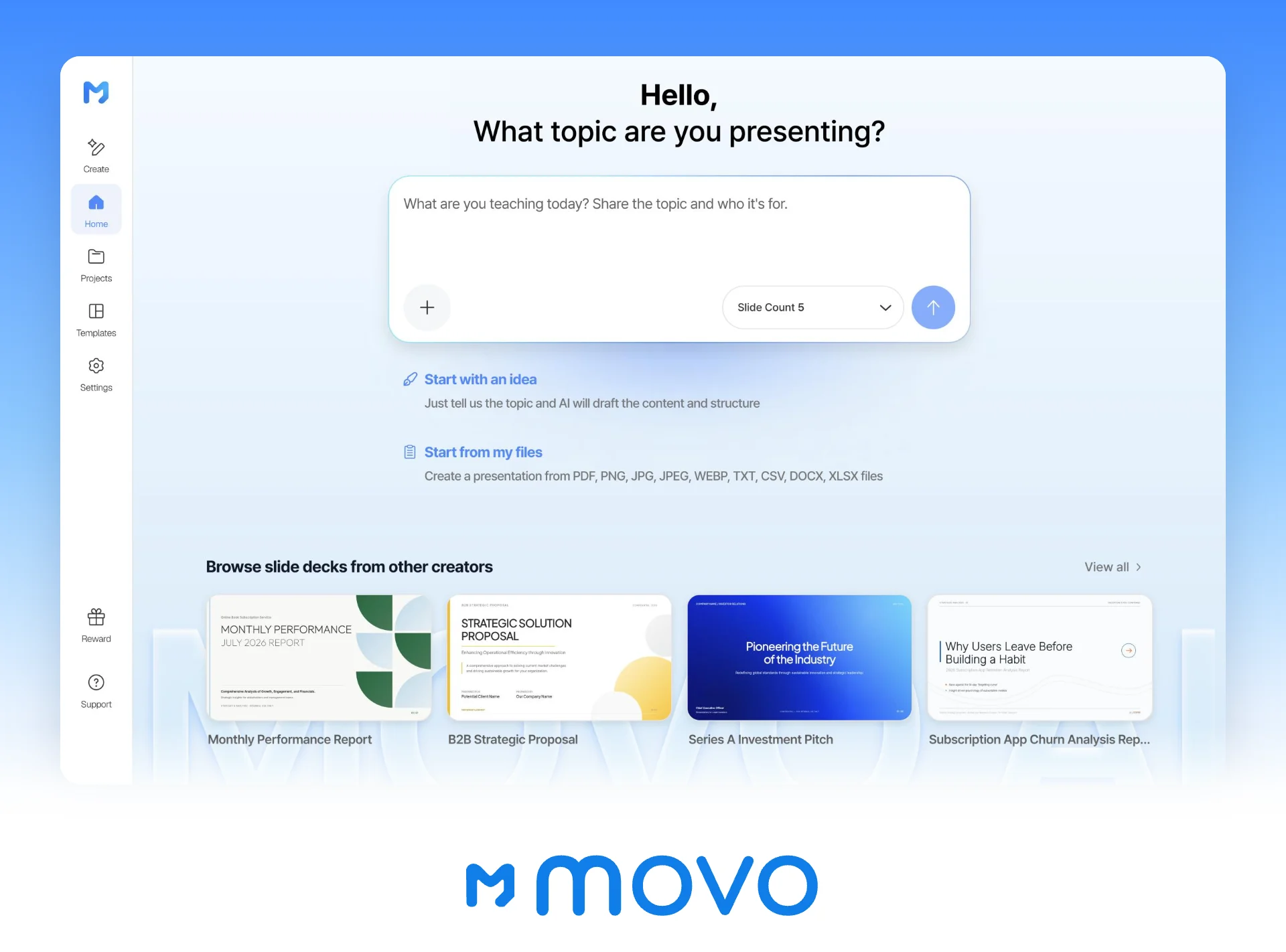
In the dashboard input, say who the deck is for and which rules to follow, then attach your research. Set the slide count here too.
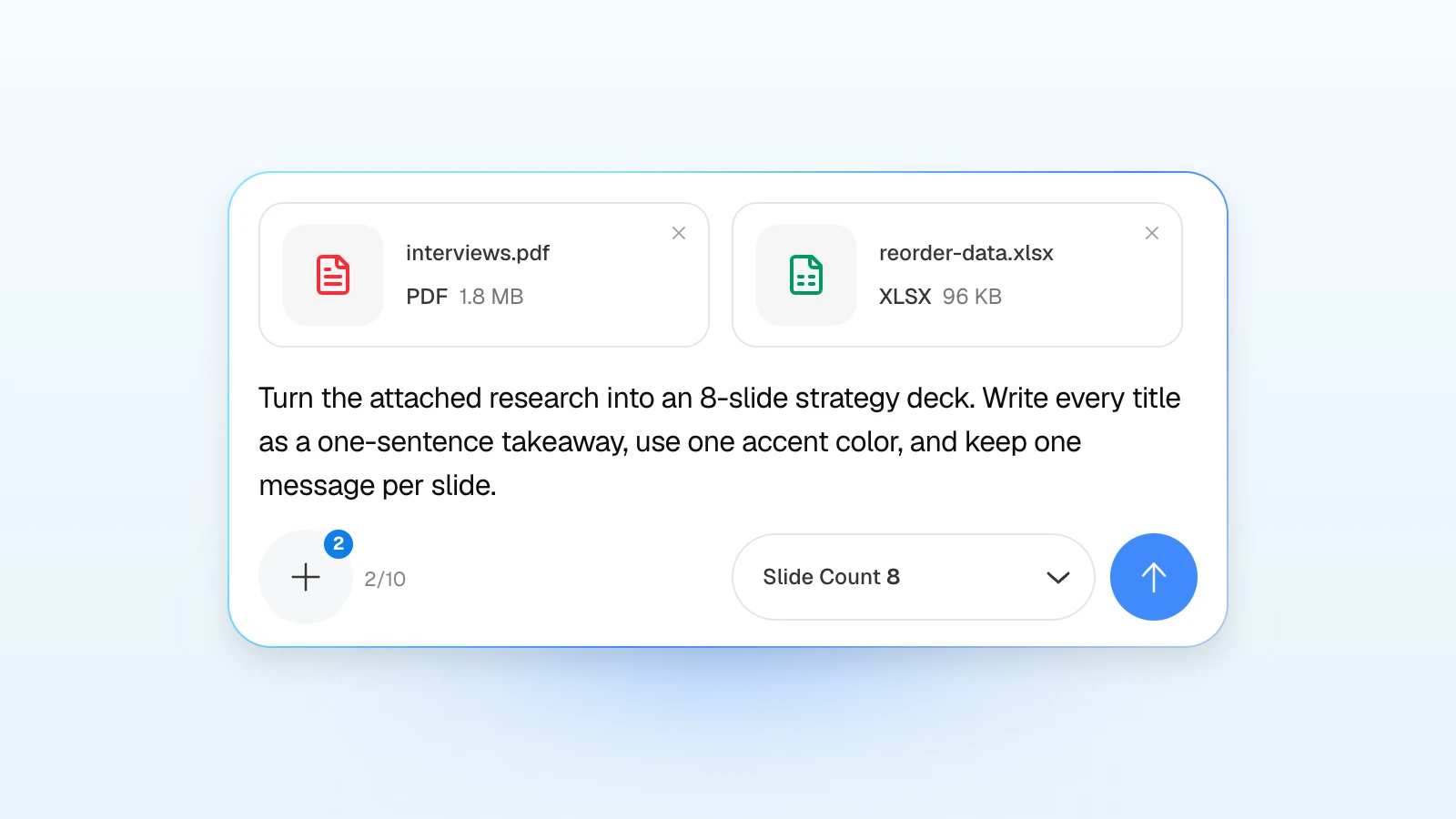
Try a request like this:
Turn the attached customer interviews and reorder data into an 8-slide strategy deck for our leadership team. Write every title as a one-sentence takeaway, keep one message per slide, and use one accent color only for the most important point on each slide. Keep every number exactly as it appears in the spreadsheet.
2. Rewrite titles as takeaways in the outline
Review the title and details MOVO suggests for each slide, and turn any topic-only title into a takeaway. Drag slides to reorder them. What you change here is what gets built.
3. Set the audience, density, colors, and fonts
In settings, choose "Executive" as the audience, "Airy" for design density, and "Formal" for copy tone. Below that, Colors and Typography set the background, brand colors, and fonts.
4. Pick a design
Choose "Report / Analysis" as the document type to see only report styles. Open "Preview" to see sample slides, then pick one.
5. Polish one slide at a time
If the accent color has spread across a slide or the supporting text runs long, select that slide and ask in the AI panel on the left, or edit it on the canvas.
6. Export the file
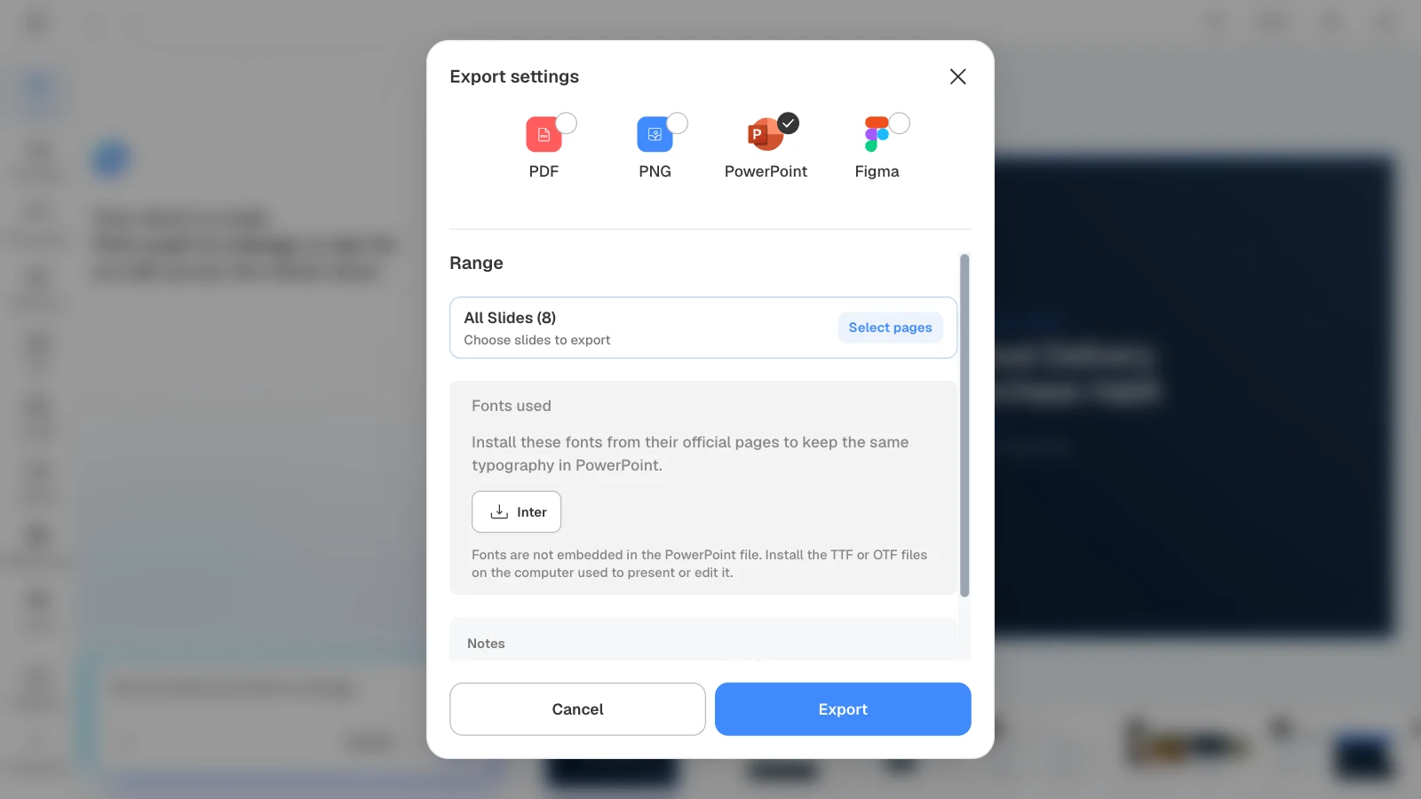
Send a PDF when the deck is for reading, and a PPTX when the recipient needs to edit it. When you choose PowerPoint, MOVO lists the fonts the deck uses so you can install them on the presenting computer.
Three clean templates to start from
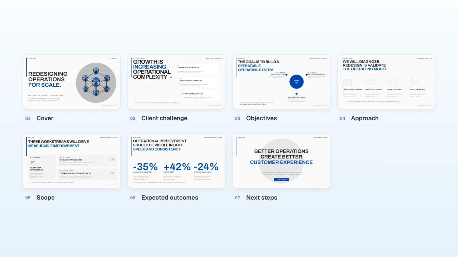
These are MOVO templates written for a global audience. The companies and numbers in them are fictional and show structure only. Copy one into your projects and replace the content.
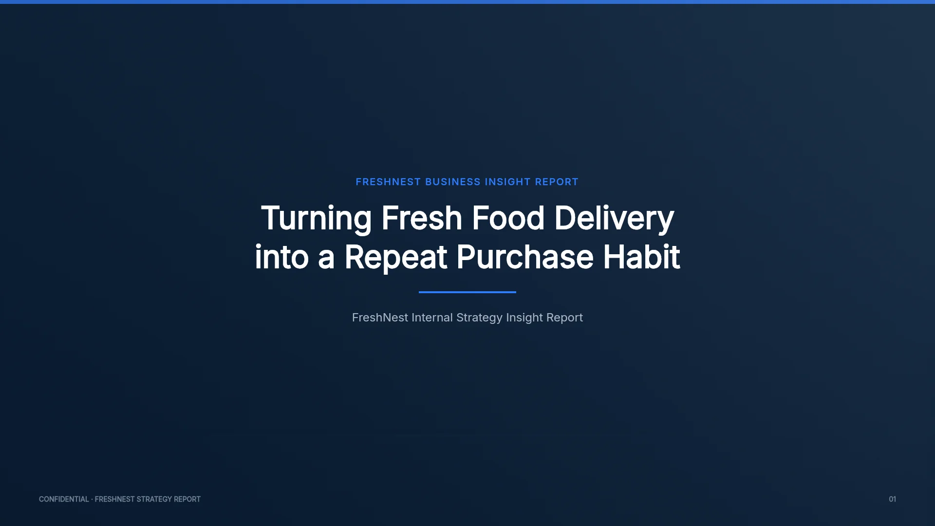
1. Fresh Food Delivery Strategy Analysis (8 slides)
An internal strategy report where every slide pairs a small topic label with a full-sentence headline, repeats the same header position, and keeps to navy, gray, and one blue accent. Fits strategy reviews and recommendations for leadership.
View the Fresh Food Delivery Strategy Analysis template
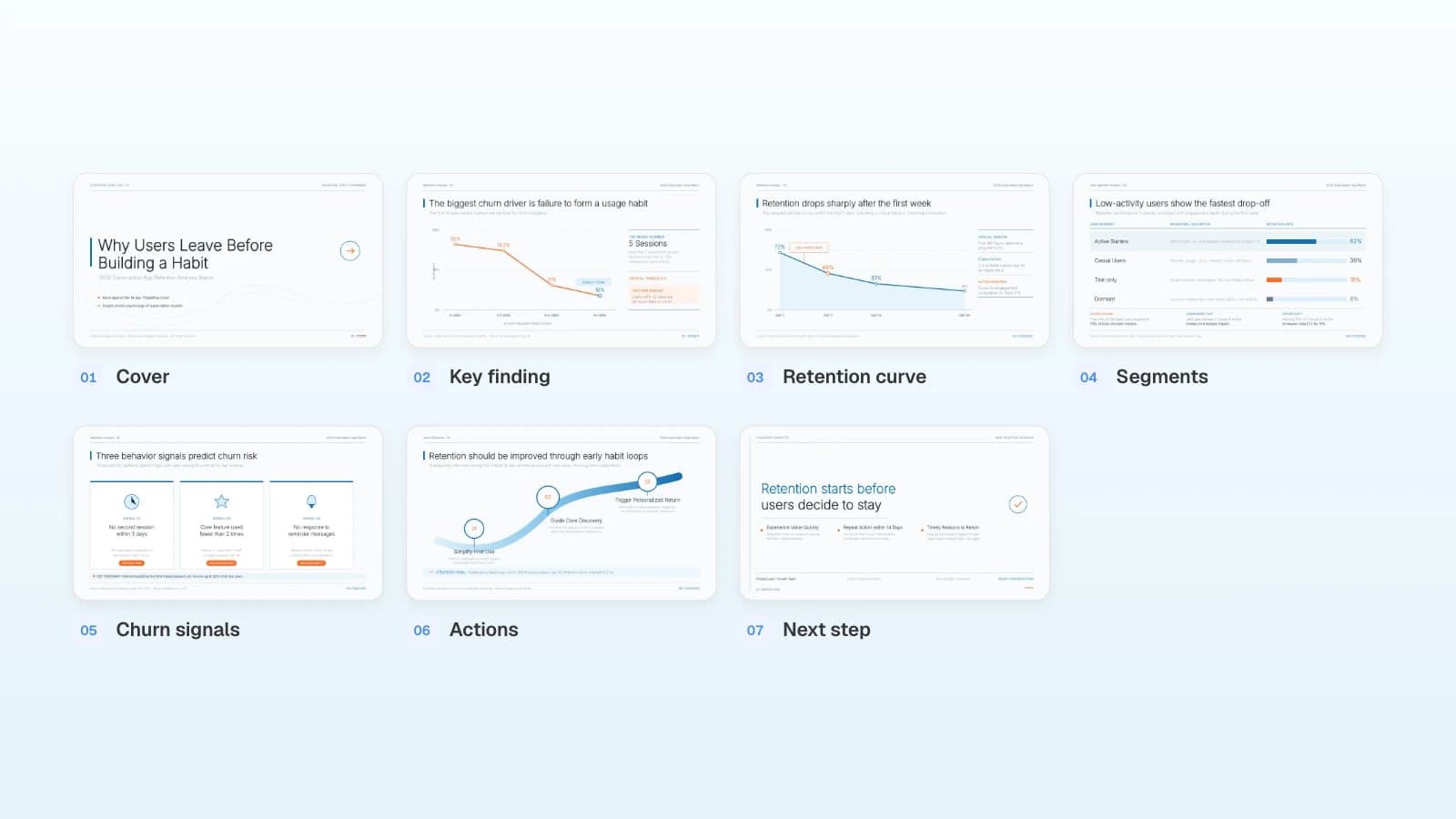
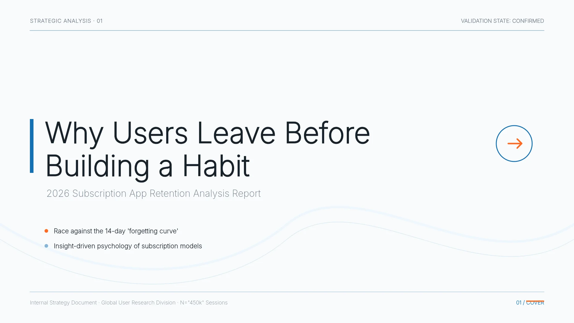
2. Subscription App Churn Analysis Report (7 slides)
A product analytics readout whose titles are findings, such as "Retention drops sharply after the first week," each backed by one chart or table, with blue and orange as the only accent colors. Fits product and growth teams presenting research.
View the Subscription App Churn Analysis Report template
3. Healthcare Market Analysis Report (13 slides)
A market analysis that states a claim in every title, such as "Markets ripe for startups differ from markets requiring preparation," on a black-and-white base with one magenta accent. Fits market research readouts and background decks for investors or partners.

View the Healthcare Market Analysis Report template
Frequently asked questions
Do professional slides need exactly three colors?
No fixed number works for every deck. The easiest system is a neutral base (black, gray, white) plus one accent color that always means the same thing. Charts that need more categories can use tints of the same color, labels, or a legend. Check contrast for text and for colors in graphs.
How many fonts is too many?
One or two is enough. Use one family for headings and one for body text, or a single family in two or three weights. Keep decorative typefaces for the cover or large display text.
Should every slide title be a full sentence?
Content slides read fastest with a takeaway title. Covers, agendas, section dividers, and question slides are the exceptions. If you can't write the takeaway, decide first what the audience should remember from that slide.
Does picking a template or style mean the design is done?
No. A style is a starting point, and editing content can create overlaps or spread the accent color around. After editing, run Check layout, go through the six checks again, and open the exported file on the computer you will present from.
Where do you change the design in MOVO?
Before the deck is built, use the settings step (audience, design density, tone, colors, typography) and the design step (styles narrowed by document type and mood). Afterward, select a slide in the editor and ask the AI panel for changes such as "one accent color only" or "keep the supporting text to three lines," or edit text, elements, and the background on the canvas.
Summary
Slides look professional when they follow a few rules, not when they get more decoration. Give each slide one takeaway title, build three clear levels of hierarchy, keep recurring elements in the same place, use one accent color and one or two fonts, then check contrast and collisions. If you already have material, put it into MOVO with these rules in the request and start from the outline.